
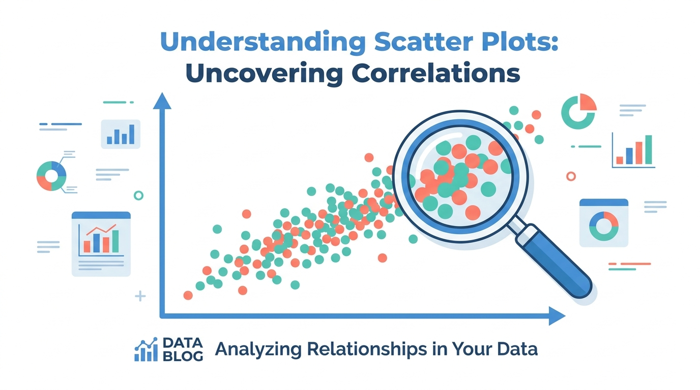
How to Create Effective Scatter Plots for Data Analysis
Scatter plots are one of the most underused chart types in business reporting. While bar charts and line graphs get most of the attention, scatter plots are uniquely powerful for one thing: showing the relationship between two variables. Correlation, clusters, outliers, and distribution patterns all become visible the moment you plot your data on an XY grid.
This guide covers when to use scatter plots, how to build them effectively, and the tools that make the process fast.
When Scatter Plots Are the Right Choice
A scatter plot works when you have two numeric variables and you want to understand how they relate. Common business examples include ad spend versus conversions, employee tenure versus performance rating, price versus units sold, and page load time versus bounce rate.
The chart answers a specific question: when one variable goes up, does the other go up, go down, or stay flat? If the dots form a clear diagonal, you have a correlation. If they form a cloud, you don’t. If most dots cluster tightly but a few sit far away, those outliers are worth investigating.
Scatter plots don’t work for categorical data (product names, departments, countries). For those, use a bar chart. They also struggle with more than about 500 data points on a standard chart size, because the dots overlap and the pattern becomes unreadable. For large datasets, consider a heatmap or a hexbin plot instead.
Building a Scatter Plot That Communicates
A common mistake is to generate a scatter plot with default settings and assume the reader will extract the insight. Most readers won’t. The chart needs to do some of the interpretation work for them.
Start with clear axis labels that include units. “Revenue” is too vague; “Monthly Revenue (USD)” tells the reader exactly what they’re looking at. Next, add a trendline if the relationship is roughly linear. A trendline turns “the dots seem to go up and to the right” into a visible slope that the reader can evaluate at a glance. Finally, consider using color or size to encode a third variable, which turns a simple scatter plot into a bubble chart. Bubble size can represent market size, team headcount, or any other metric that adds context.
For axes, always start at zero unless there’s a strong analytical reason not to. Truncating the axis magnifies small differences and can mislead the reader into seeing a stronger relationship than actually exists.
Tools for Making Scatter Plots
Spreadsheet tools like Excel and Google Sheets handle scatter plots well for small datasets. Select two columns, insert a chart, and pick the scatter type. The limitation is styling: Excel’s default scatter plot looks like it was designed in 2005, and Google Sheets’ version is only slightly better.
For faster results with better defaults, an online scatter plot maker like ChartGen AI lets you paste your data and get a styled chart in seconds. You can also describe the chart in natural language (“scatter plot of marketing spend vs conversions, with a linear trendline”) and the AI generates it directly. The output is clean enough for a slide deck without manual formatting.
For programmatic workflows, Python’s matplotlib and seaborn libraries offer the most flexibility, but the learning curve and setup time make them impractical for one-off charts.
Common Mistakes to Avoid
The most frequent scatter plot mistakes are connecting the dots with lines (which implies a sequence where none exists), using too many colors when a single color with a trendline would be clearer, and forgetting to label axes. Another common issue is plotting correlated variables and implying causation. Two variables can move together without one causing the other; correlation is not causation, and the chart itself can’t distinguish between the two.
Conclusion
Scatter plots are the right chart for the right question. When you need to show how two variables relate, no other chart type is as direct. Keep the design clean, add a trendline when appropriate, label your axes clearly, and let the data speak.


